Pantone Crowns "Cloud Dancer" White the Colour of the Year
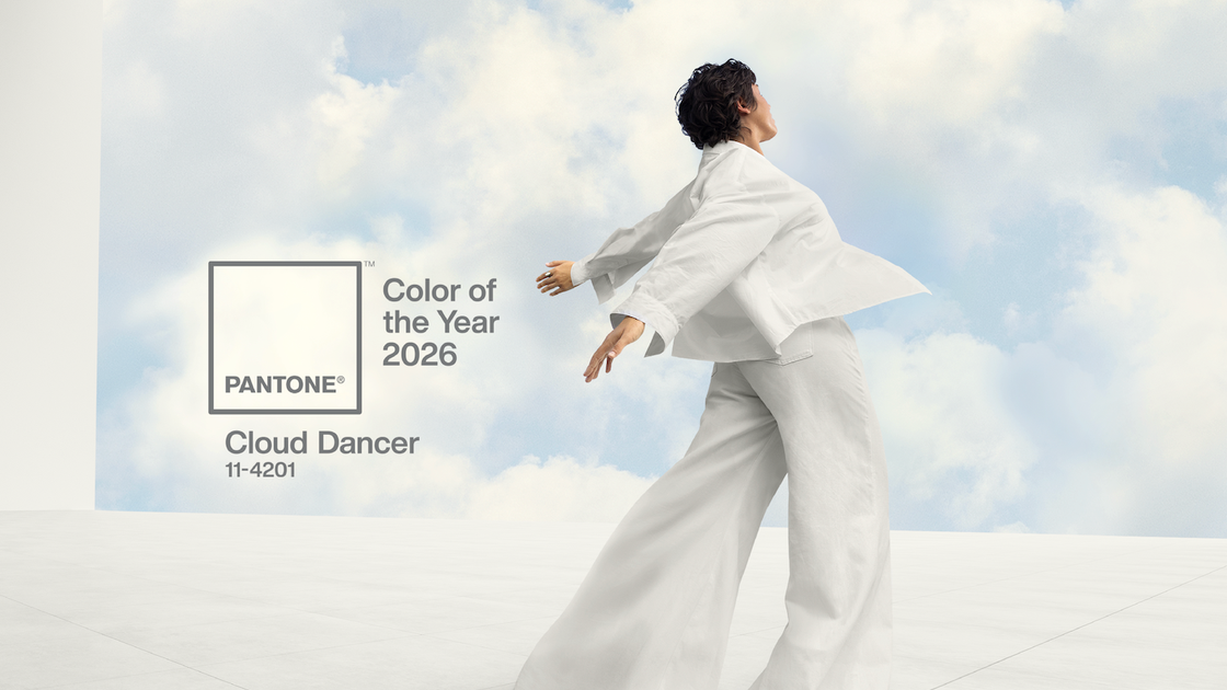
Pantone has done something few colour forecasters dare to do. For 2026, the global colour authority has named Cloud Dancer, a soft off-white, as its new Colour of the Year, positioning a near-neutral shade at the centre of the design conversation. For an industry that trades in palettes, pigments and before-and-after transformation, the idea that “the colour of the year” is essentially white will feel either like a provocation or a gift. In beauty, it is probably both.
Cloud Dancer does not arrive in a vacuum. It follows two cosy, comforting tones that dominated moodboards and merchandising: Peach Fuzz in 2024, a velvety, nurturing peach, and Mocha Mousse in 2025, a cacao inspired brown designed to evoke simple pleasures and warmth. Together, those choices spoke to comfort, tactility and a desire to cocoon. By contrast, Cloud Dancer is being framed as a “promise of clarity” and a visual reset, a whisper of calm in what Pantone describes as an overstimulated, noisy world. In that context, white is less about absence of colour and more about the idea of a fresh page.
For beauty brands and professionals, this pivot from comforting colour to structured neutrality mirrors a wider consumer mood. Clients are increasingly savvy about ingredients, efficacy and ethics. They are looking for proof, not just pretty packaging. White, with its associations of clinical rigour, lab coats and spa linens, taps into that appetite for perceived purity, transparency and “nothing to hide” formulas. The risk, of course, is that what reads as minimalism to some can feel sterile or exclusionary to others.
Cloud Dancer is a very specific white: soft, balanced and slightly warm, rather than optic or icy. That nuance matters. Cooler, blue-based whites can skew harsh on skin, particularly on deeper tones and in LED lit retail environments. A warmer white immediately feels more forgiving, more textile than tile, which is exactly where the opportunity lies for the sector.
Packaging designers can use Cloud Dancer as a base that allows textures to do the talking. Think raised lettering, soft touch varnishes, ceramic-inspired finishes or frosted glass that let a formula’s colour show through rather than relying on saturated outer cartons. Spa and clinic owners can revisit visual identity, from towels and robes to menus and wayfinding, dialling up a sense of clarity and order without tipping into “dentist waiting room” territory. For indie brands that have leaned heavily into beige and greige in recent years, a shift towards this lighter, slightly more luminous white could signal an evolution rather than a total rebrand.
Importantly, Pantone is not asking the world to abandon colour entirely. Alongside Cloud Dancer, trend agency WGSN and its sister colour system Coloro have highlighted Transformative Teal, a blue-green that symbolises ecological awareness and change.
In practical terms, a white Colour of the Year can feel counterintuitive for artists and technicians who work daily to neutralise grey tones and lift sallowness. Yet in editorial and consumer beauty, white has always been a quiet workhorse shade. Pantone itself highlights Cloud Dancer’s versatility as a base that can be paired with pastels for a dreamy effect or with strong blacks for sharp contrast, especially in eye and nail looks.
On eyes, think diffused white cream shadows that sit under micro shimmer, giving lids a milky halo rather than a stark chalk line. Negative space eyeliner, where a fine white line slices between two colours, can feel both architectural and wearable. For nails, the already huge appetite for “milky manicure” looks finds a clear ally in Cloud Dancer, which reads more like breathable porcelain than Tipp-Ex. A sheer, buildable white lacquer layered over a natural nail bed, finished with high gloss, gives a premium, whisper-clean effect that suits every age group.
Hair colourists may gravitate more towards finishes than flat colour. Cloud Dancer translates naturally into pearlescent toners, opalescent topcoats and carefully placed face-frame highlights that brighten without pushing clients into high maintenance silver territory. In retail, white accessories from satin pillowcases to heat-tool casings can be used to reinforce the story without overwhelming shelves already crowded with brand colour.